Investigating our Googles
|
|
The question we are trying to answer under this heading is: What path does Google determine for us in combination with our heuristics compared to the roads opened by the Issue-Crawler? Looking at the two networks above, we want to explore how different network embeddings alter what we find and what we represent.
The experiment is simple: If we let a generalized version of Google (duckduckgo.com) determine our vision, what will become visible and what will we miss compared to a more generic search.
The two networks we compare are:
First the Google Slave Network described in the Navigating our Entry, gathered in part by the top results from Google and partly through snowball sampling from these starting points. The second network is constructed by launching an Issuecrawl with three iterations from every site in the original network. A co-link analysis has been made and sites lacking more than one in-link is not in our body. A manual filtering has been made going through the top 120 sites with the specific pages being linked to. Looking at the URL we determined whether the link was of commercial character and irrelevant. Next we found generic actors such as About.com creating its own community of authority described in another segment.
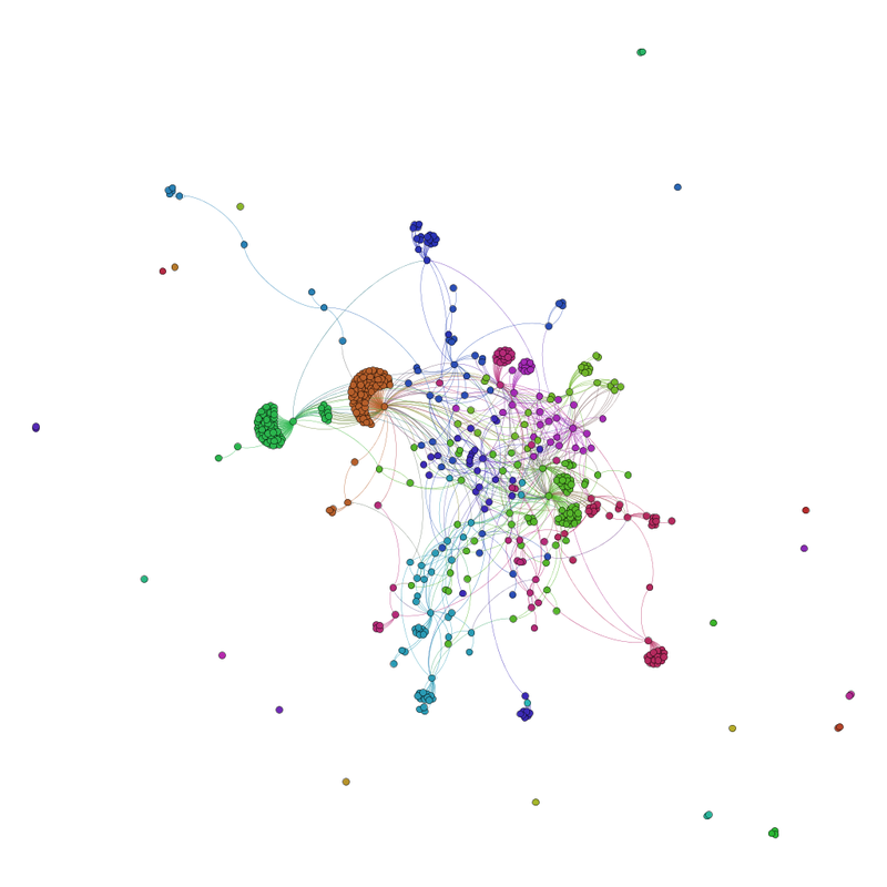
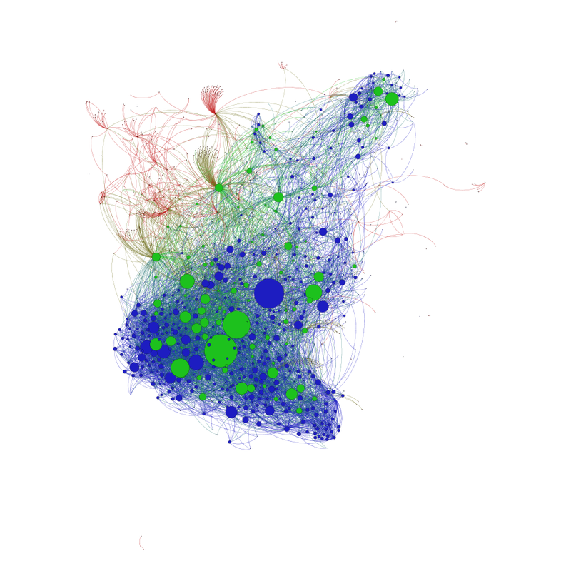
Let's begin by looking at the above networks: To the left we see the original network consisting of 562 nodes and 930 links between them colors represent 'Community Structure'. To the right the same network is embedded in an Issuecrawl, The Green nodes are the nodes surviving the Co-link analysis, the Red ones the rest of the original network, and all the Blue represent the ones that we had no prior knowledge about. The sizes are merely in-degree a leading heuristic in our analysis. Obviously the important actors according to in-degree was in the original network and but looks like a big Blue node was overlooked. The above comparison looks quite comforting, however if we compare how the nodes are relatively weighed by their embeddings we see very different patterns.
The experiment is simple: If we let a generalized version of Google (duckduckgo.com) determine our vision, what will become visible and what will we miss compared to a more generic search.
The two networks we compare are:
First the Google Slave Network described in the Navigating our Entry, gathered in part by the top results from Google and partly through snowball sampling from these starting points. The second network is constructed by launching an Issuecrawl with three iterations from every site in the original network. A co-link analysis has been made and sites lacking more than one in-link is not in our body. A manual filtering has been made going through the top 120 sites with the specific pages being linked to. Looking at the URL we determined whether the link was of commercial character and irrelevant. Next we found generic actors such as About.com creating its own community of authority described in another segment.
Let's begin by looking at the above networks: To the left we see the original network consisting of 562 nodes and 930 links between them colors represent 'Community Structure'. To the right the same network is embedded in an Issuecrawl, The Green nodes are the nodes surviving the Co-link analysis, the Red ones the rest of the original network, and all the Blue represent the ones that we had no prior knowledge about. The sizes are merely in-degree a leading heuristic in our analysis. Obviously the important actors according to in-degree was in the original network and but looks like a big Blue node was overlooked. The above comparison looks quite comforting, however if we compare how the nodes are relatively weighed by their embeddings we see very different patterns.
|

|
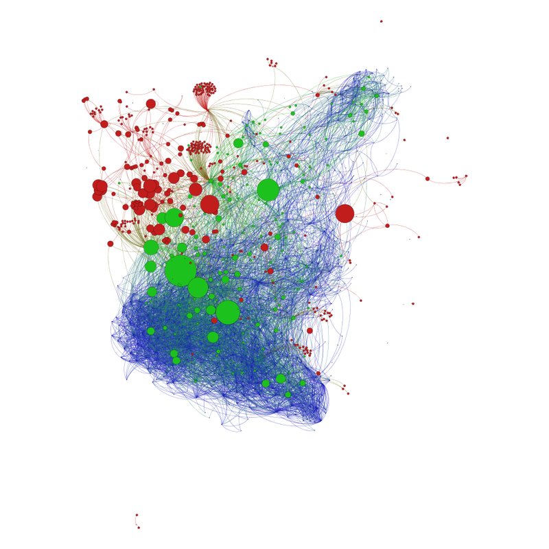
Comparing the original in-degree with the new in-degree, we see quite different patterns. We see that the relative sizes of the actors have changed a lot. A relatively small node in the original (marksdailyapple.com) is the biggest in the Issuecrawl. To investigate these over and underestimations systematically we have created the following interactive visualization (we suggest you open it in a new window). Here we focus on the intersection between the Entry Network and the Network Issuecrawled network. These 97 actors are ranked according to there in-degree in both networks. Using a rank instead of the original in-degree let's us compare the relative visibility in each network, because five in-links in small sample network might be big compared to 20 in a much broader sample of the network. Nodes are arranged in a circle lined up from top to bottom. Size and color-code express rank in entry network and rank in Issucrawl network respectively. The most basic thing to notice is that the color-coded heat map do not follow the same predictable pattern, but clicking on each node let's you compare not only the differences of in-degree, but includes the other network statistics described in the segment Entering the Paleo Diet.
'
'
Mislead by colors of similarity
The next analytic I want to introduce is concerned with the heuristic of community detection. The colors and spatialization are very effective heuristics, for filtering out information, with regards to assumption of similarity that this part of the map can be exhausted by one look and making us overlook actors that relative to it's community is small, but to the whole network big. The next visualization shows how many false 'color-twins' each site had at our entry point compared to the Issuecrawler Network. For all the sites in the original network it compares the intersection of the two different communities with the original size of the original community. From that it calculates the overestimations numerically and as a percent of the whole community. In the visualization below you can see the distribution of overestimations and use degree as a reference point.
