Exploring Content in the 'Entry Network'
|
When mapping an issue there are big dilemmas concerning scope and detail, structure and content. With respect to the mapping idea we wished to pursue both, but instead of letting the two be incongruent, we tried to use them together. Again we use the more broad and quantitative approach, which serves as a heuristic tool, guiding the investigators for actors relevant in the discussion in different ways. This segment explains how we used quantified wordcounts estimated by Google, in the so-called Lippmanian Device as navigators in our initial Network. The idea is to use the keyword categories as guides attenuating differences that the network analytics can't catch.
Lippmanian Device is a parasite on a not so well-willing host: Google. Although computational and quantitative we had to limit our queries. This means cutting the amount of words to look for, and on the amounts of websites to look in. Again basic network analytics becomes decisive: We simply choose the top 50 sites with regards to in-degree. The question is now, what are the websites talking about, and how to get clues. |
Developing Keywords
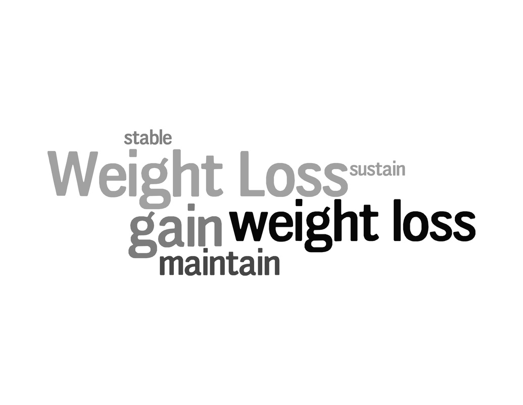
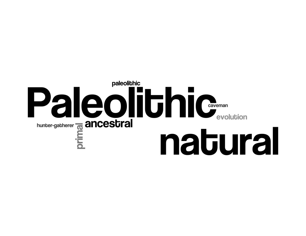
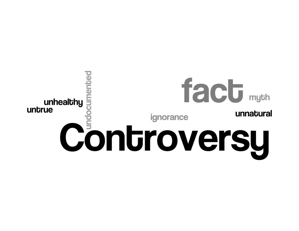
To create a list of keywords we made an explorative reading of many of the websites of the top actors in the network as well as exploratory word-clouds of several sites in our entry network. Since one of our main interests have been to find out wether the publics are mostly interested in paleo due to health or weightloss we searched words indicating this among other things like how scientific the spheres are plus words indicating the commitment to the paleolithic era. Following this explorative reading we ended up with four keyword categories with a number of keywords indicating the category:
The Google servers was put into action for our noble cause, and when they were done the results below came out: an illustration of the relative distribution illustrating the relative size of the keywords in each aggregated category. |

|
|
|

|
|
Integrating the tag-categories with the network
|
On the graph below you see the 'distribution' of the top 50 from our navicrawl around the different keyword categories(44 of which were succesful). By interacting with the graph you can get a detailed insight in the content of the homepages. The purpose is to use it as a navigational tool. Looking for scientific proof we see which actors uses those words most. Looking for controversy Hellsditch.com becomes highlighted. At the same time you can relate the share of the categories to network degree, to keep a sense of important actors, and the Paleo tag which is brought to express to which extent the website is dedicated to paleo only, or evolves around lots of other issues.
As a general observation we can see that all the homepages together uses science, health and paleolithic more than the other keyword categories. |
If you click on the homepages in the list on the left side you can se each homepage separately and their usage of the different categories. As an example nusi.org uses science words more than the rest of the keywords even though health is also evident. When you look at degree you can see that NuSI has a relatively high degree. This tells us that NuSI is a rather important actor in our network. You can try to do the same with different actors.
In the lower right corner you can click 'Percentage' and see the actors' relatively usage of the word categories. As an example you can see that bodybuilding.com uses 'weight loss' more than the rest of the actors. Hells-ditch.com is talking a lot about controversy which makes sense since we know that it is critical homepage. You are welcome to explore as much as you like here and on the rest of the homepage. |
